

Political Polls More Harm Than Help
Post 37 | How does it help to know what your neighbour thinks?


Political opinion polls are wearing on me. Not just because I am often boggled by the results, but because they have a nasty downside we don’t acknowledge.
Most political polls are lagging indicators and limited as predictors of future outcomes or behaviour - used to measure results or gauge societal tone.
Indeed, they are critical tools for political parties to manipulate strategy, try on different messages and conduct policy testing – yet offer little value to the broader public. Media love reporting on polls as they provide a ready-made story, and I have referenced them variously in prior articles while decrying their limitations.
But pick your analogy about their lagging nature – closing the barn door after the horse is out; Johnny-come-lately; too little too late, etc.
And ask how they’ve helped advance your own thinking on a topic.
Polls suffer multiple issues.
For starters, they are entirely dependent on the quality and framing of questions which often probe for what you believe or like, or request simplistic approve/disapprove, positive/negative ratings - more likely to dig at your base instincts than challenge your mind.
They often try to inform and ask at the same time – with susceptibly to leading the witness. From an Angus Reid post-budget poll, the following “some people have said” and “other people” question is written in an influencing manner. Meanwhile the construct of the question and answers almost ensures respondents react along emotional lines, based on leveraging a theme of making the rich pay more. Does this further inform us about an issue, or enforce a narrative and bolster entrenched positions?

Rare polls do a good job of adding trade-offs into the mix, giving us meat on the bone.
As covered in Post 11, a 2020 Angus Reid poll gauging support for universal pharmacare saw a major drop from 60% to 47% support if adding this new entitlement program were to also increase the middle income tax bracket by a mere 1%.
Similarly, a 2022 Fraser Institute survey saw a massive drop in pharmacare support from 79% to 40% if it were to be financed with a two percent increase in the GST. They likewise found support for the national daycare program dropped from 69% to 36% if the same GST increase was required to finance it. Meanwhile only 42% supported a national dentalcare program when a tax hike was added, versus 72% when it included no direct financial burden.
In the polling world these are substantial variances. The results tell us something useful but, perhaps more importantly, the questions make us think critically and intentionally rather than respond based on feelings.
We currently live in a world taught to trust our feelings, yet feelings are rarely trustworthy, particularly when it comes to decision making. Many incorrectly equate opinions captured in polls with facts but, really, they tell us only what others are feeling or thinking – not what is. To rely on them is not to inform ourselves but merely to gain comfort of the consensus view – whether it be well informed or not.
In Do We Need to Like a Prime Minister? we explored things through the similarly untrustworthy lens of likability and argued that attributes of substance and respect were far more important than whether you like a candidate.

Which brings us to a larger issue with polls - that they encourage groupthink rather than individuality of thought.
I have previously referenced the consensus trap, taken from Todd Rose’s book Collective Illusions | Conformity, Complicity and the Science of Why We Make Bad Decisions. He describes the insidious power of conformity and the destructiveness of silent acquiescence. “The truth is, we care about being in the numerical majority even when the group opinion is merely an illusion.” He further explains that we can fall into a “consensus trap” where, “This trap creates its own breed of collective illusions”.
The Overton Window is another lens through which to ponder this. The Overton Window is a political science method used to describe and track a range of ideas the public is willing to consider and accept. It has recently become popular in the political and advocacy world as a way to test how a window of public opinion can be moved without losing that public support.

Jeffrey Tucker of the
writes, “The Overton Window is a way of mapping sayable opinions. The goal of advocacy is to stay within the window while moving it just ever so much.”It applies perfectly to opinion polling, such that few are willing to venture beyond the limited window of common thought, unless or until that window shifts to a new consensus position or the aperture distinctly widens. And the consensus is often conveniently but not helpfully provided through poll results.
This is not unlike sports swarming.
For all who’ve watched young children play a team sport like soccer or hockey, you know the swarming effect. Watched from above, it’s comical to see a moving blob of players who abandon all positions in pursuit of the ball or puck. Thankfully the goalie usually stays in place and there are a few stragglers or keen players who maintain their positions, but largely the group shifts en masse. This same phenomenon is at work with political opinion polls, as reported results encourage a swarming of people to a new temporary spot.
My principle challenge with polls lies in this question - What value is derived from knowing what your neighbour thinks?
How are the latest Ipsos post-budget poll results helpful that ask, “Would you say that the overall budget is” Good (17% agreed), Bad (40%), or Neither Good Nor Bad (43%). And we learn that Atlantic Canada likes it the most (29%) with Alberta the least (11%).
Another question in that survey hits the chronic theme of self-interest with, “Do you think the overall budget will…” – Personally help you (7%), Personally hurt you (27%), Neither help nor hurt (38%) or Don’t know (27%). What does that bit of info do for you?
“Do you think the federal budget…” question then offers a hint of value in requiring a choice with options of - Focused too much on spending (37%), Focused too much on deficit reduction (13%), Struck just the right balance (13%), Don’t know/not sure (37%). Though, to comment briefly on the results - for a budget with no deficit reduction in sight, I’m not sure what 26% of people are referencing.
A post-budget Leger poll prompted this heading atop a National Post article - “Canadians Mixed on Federal Budget” - perfectly highlighting the limited value of polls. Absent 100% consensus, polls are always mixed aren’t they?
The survey’s second question offers multiple options to be chosen but misses an opportunity to demand rank ordering. Results tell us only that we kinda want everything.
The third question almost enforces a trade off, though tilts the question by referencing the projected smaller deficits to apparently begin five years in the future. That this government has never met a prior deficit reduction target and will likely not be in power should not be missed. And perhaps a None of the above would be an appropriate option to offer.

If everyone reading the polls were inspired to independently ponder the questions, that would have some value. But human nature tells us many will be more influenced by the results than prompted to individually cogitate. And, I argue this is more damaging than helpful as we swarm the puck.
This probably all seems a bit harsh – where every poll question can be critiqued. And indeed that is the point, where questions and responses can turn on a single word, or be nudged by using weighted choices versus rank order or yes/no options, for instance.
Take the last Leger question above. Imagine the different response if we made the following addition, “The Minister of Finance announced that the deficit for the federal government will be $39.8 billion this year and projected to be around $20 billion by 2028-29, along with projected debt interest costs of $60.7B by that year”. Among the following three choices…?”
Or how about repackaging it to, “This year’s projected deficit is $39.8B, only fractionally down from last year which was $10 billion higher than originally projected. Among the following three choices…?”
Or, “With the government’s last three years of +$142 billion cumulative spending misses beyond projections, this year’s deficit is projected at $39.8. Among the following three choices…"?
…just imagine the countless ways this single question could be packaged.
This brings us to the final issue with polls. How the results are reported can be significantly torqued.
Most surveys can be found on the respective pollster’s website, where you can download the report – sometimes with full data tables. Responses are usually delineated by various attributes such as region, gender*, age, generation, household income, home ownership, child status, education and more. But only the most intrepid readers (and some writers) will dig into such details. Media outlets are provided with packaged reports including summary analysis and high level metrics, and many news stories don’t dig beyond those sculpted narratives despite the many perspectives that data analysis could uncover.
So, how easy is it to change the way a reader sees the results?
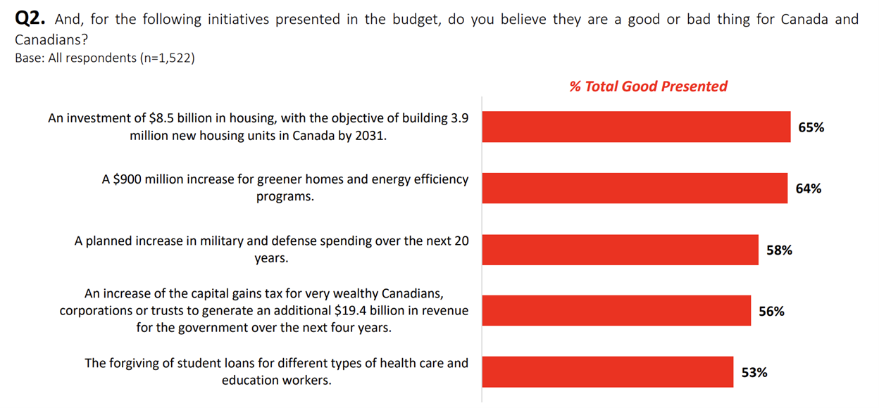
From the Leger poll, the second question’s results could be framed as, “Nearly 60% of Canadians support a substantial increase in military investment”. This is subtly different than if we chose to say, “42% of Canadians do not name military spending as a priority”.
We could report, “Two thirds of men but only half of women support stronger military spending”, which is quite different than, “More than half of men and women agree with stronger military support, with men at 66%.”
From their third question, a statement of, “84% want spending cuts or are on the fence”, evokes quite differently than, “84% want action on the deficit or are not opposed.”
None of these statements are wrong, but they push and pull the narrative in different directions and some are unfairly and sneakily packaged, minimally suffering the sin of omission if not outright misrepresentation. There are countless ways to gin things up, but how would you know you’re being led?
For that matter, how do you know I’ve not selectively chosen only examples that prove my case in writing this article - whether intentionally or not? And how many care enough to dig in to know what boundaries I’ve pushed?
So, this diluted game of telephone leaves the field wide open for poorly contextualized, badly researched, creatively packaged or selectively reported results, with few to question them (reference Post 30 for a few climate change/net zero examples).
[*As an aside, out of 1001 respondents in the Ipsos post-budget survey, seven (7) people identified as neither male/female or prefer to not say, representing a mere 0.7% - this in a country that’s turned itself inside out over gender issues the past few years]
As we experience growing tumult in our political landscape and eventually move into 2025 election preparation, look critically at what polls are saying and whether you’re thinking independently or being swept away by consensus opinion.
Ask yourself - would you take health advice from a poll of strangers believing celery juicing was the answer to all health woes? Would you take your cue on best cancer treatments from an online survey? How about legal advice from an opinion poll? Didn’t think so.
If you read polls that include trade-offs, hard choices or questions that speak to the good of the country rather than asking about personal feelings, preferences and self-interest – sit up and take notice. And ask yourself those same questions, while relying less on the results of how others responded.
Until then, read them as entertainment if you wish - but do your own thinking, critical analysis and decision making and let others follow your lead if they can’t think for themselves.
Stay tuned and stay pragmatic.